Brand Description:
Mental health conditions are common, affecting roughly one in five U.S. adults experiencing mental illnesses annually. Those who experience mental health conditions often feel isolated from others, including their closest friends and family. Dealing with this isolation daily can be too troublesome and overbearing for someone to face alone. With Echo: Music & Art Festival, people no longer have to struggle alone.
Echo: Music & Art Festival is a three-day festival located in Willmington, Pennsylvania focused on positivity, connection, education, and growth. While acting as a music and art festival first, Echo: Music & Art Festival also runs as a mental health awareness campaign that emphasizes the importance of mental health. Echo’s proceeds go directly towards mental health awareness, research, resources, education, and crisis intervention. To promote mental health awareness, Echo: Music & Art Festival hosts meditation circles, yoga groups, mindfulness sessions, and more experiences that foster positivity amongst visitors.
As a music and art festival first, Echo has a lineup of bands that will keep festival-goers jamming the whole stay. Located at the main stage, bands perform throughout the day and into the late evening. Echo: Music & Art Festival is located in the Little Pine State Park in Pennsylvania where camping is strongly encouraged for guests to have the full experience. Echo: Music & Art Festival also hosts a variety of art and food vendors for guests to browse and purchase from. Echo: Art and Music Festival is for guests 21 years or older. Guests can choose to stay on festival grounds or come and go as they please. Echo: Music & Art festival is specially curated to promote connection and positivity for all who attend.
Deliverables:
1 Primary Logo
1 Brand Guidelines
7 Page Website
1 Ticket
1 Confirmation Email
3 Day Pass Lanyard Cards
1 Staff Lanyard Card
1 Staff T Shirt
1 Band Lineup Poster
5 Wristbands
1 Pocket Guide Map
3 Environmental Graphics
Proposal:
Music festivals are a staple in the music scene throughout the world. Many music festivals are known for their eye-catching graphics and strong branding techniques that are used to draw in guests and promote ticket sales. Creating a music & art festival with a strong brand is absolutely necessary to achieve these goals. My mission for this assignment is to create a brand identity and design components for a fake music and art festival. The identity of this fake brand is Echo: Music & Art Festival. Echo: Music & Art Festival is a festival that hosts various indie and alternative bands throughout a three-day period. The festival is known for its live performances, art vendors, and live events.
Mental health is often overlooked and not spoken of much at all. In fact, mental health conditions are so common they affect roughly one in five U.S. adults. To change this, Echo: Music & Art Festival will use all of the festival’s proceeds and ticket sales for mental health awareness campaigning, research, resources, education, and crisis intervention. Echo: Music & Art Festival’s brand will be designed with the mental health side of the festival in mind. My intention is to design the Echo: Music & Art Festival brand with bold and exciting graphics that promote positivity while maintaining a certain edginess that matches the music genre.
This branding assignment will contain a wide range of design components that are cohesive throughout the brand. Each component of my branding assignment will be designed to promote ticket sales, guest engagement, and provide a positive experience for all guests. While designing I will maintain a consistent brand and stay detail-oriented to create a lasting design. To showcase my brand designs, I will also create multiple digital mockups for my designs. The target audience for Echo: Music Art Festival is music and art lovers 21 and older in the United States. This assignment aims to draw in guests who enjoy festivals, music, art, camping, and community.
Objectives:
Thoroughly research mental health awareness campaigns and music festivals to correctly capture the aesthetic and tone of the event.
Establish a clear brand identity that is cohesive throughout the brand.
Research and design a logo, staff T-Shirt, ticket, day pass, wrist band, website, band schedule, pocket guide map, brand guide, and environmental graphics.
Apply knowledge of design principles and research into branding, typography, illustration, and web design.
Design graphics that are eye catching to communicate the festival’s mood and style to promote ticket sales.
Incorporate feedback from my classmates and instructors throughout the design process of my brand.
Target Audience:
Echo: Music & Art Festival’s target audience is music and art lovers 21 and older in the United States. Despite being only in Pennsylvania, Echo: Music & Art Festival urges all festival lovers across the United States to attend. This festival is aimed to draw in young adults, artists, and anyone who enjoys music, art, and unique experiences filled with connection. The people attending are those who like being part of something meaningful. People often deal with everyday stress from work, relationships, and life changes. Echo: Music & Art Festival is here to help these people have an open space that allows them to express themselves and feel welcomed.
Echo: Music & Art Festival also calls to people who care about mental health and personal well-being, whether it be for themselves or others. This includes artists, music lovers, and those interested in self-care or mindfulness. Echo: Music & Art Festival creates a space where people can connect, feel understood, relax, and enjoy music and art while also being part of something that supports mental health awareness.
Research Synopsis
Researching various music and art festival brands was a key factor in my design process for Echo: Music & Art Festival. By examining these festival brands, I ensured that I exposed myself to branding that I was not familiar with, and I learned the importance of creating a strong and cohesive brand. My research process started by looking at music festivals located in the United States. I researched various music festivals that hosted indie, alternative, and psychedelic bands that would match the genres playing at Echo: Music & Art Festival. Branding from Elements Music and Arts Festival and Threestival helped me better understand the design trends within the music and art festival scene. This research gave me knowledge to move forward with my design process and start sketching out my designs.
Viewing these festival websites was the next step in my research process to move forward with my website. While viewing the websites of Elements Music and Art Festival, Threestival, and SXSW, I understood that bold graphics are an absolutely necessary component when designing a music festival brand. Researching festival websites also allowed me to understand what would be necessary for my navigation through my website. I also used Pinterest to view different collage and grunge style graphics that I would be incorporating into my brand. Researching mental health campaigns like MentalHealthPH, Mental Health America, and NAMI were absolutely necessary to designing with mental health campaign branding in mind.
Process Work
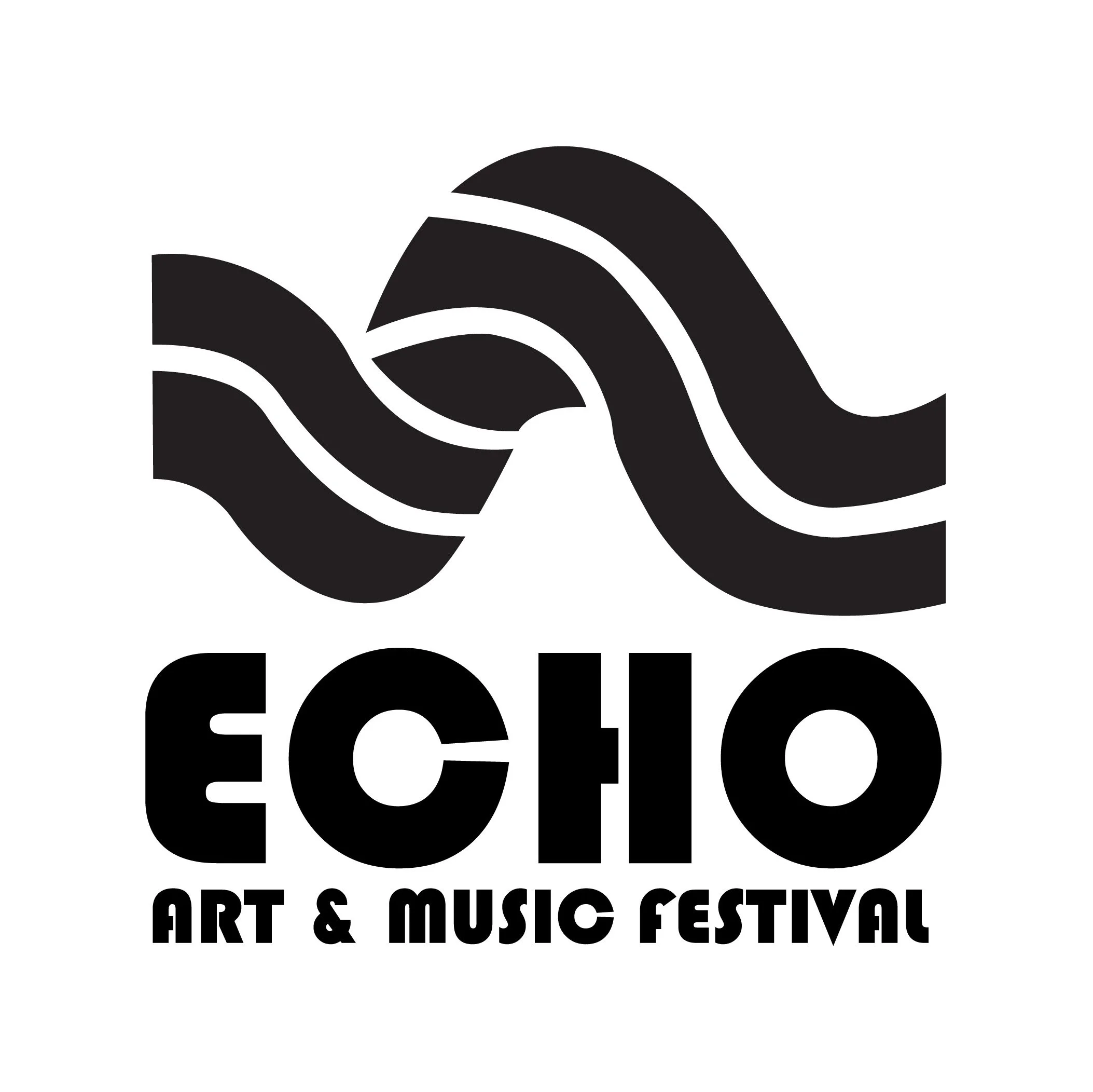
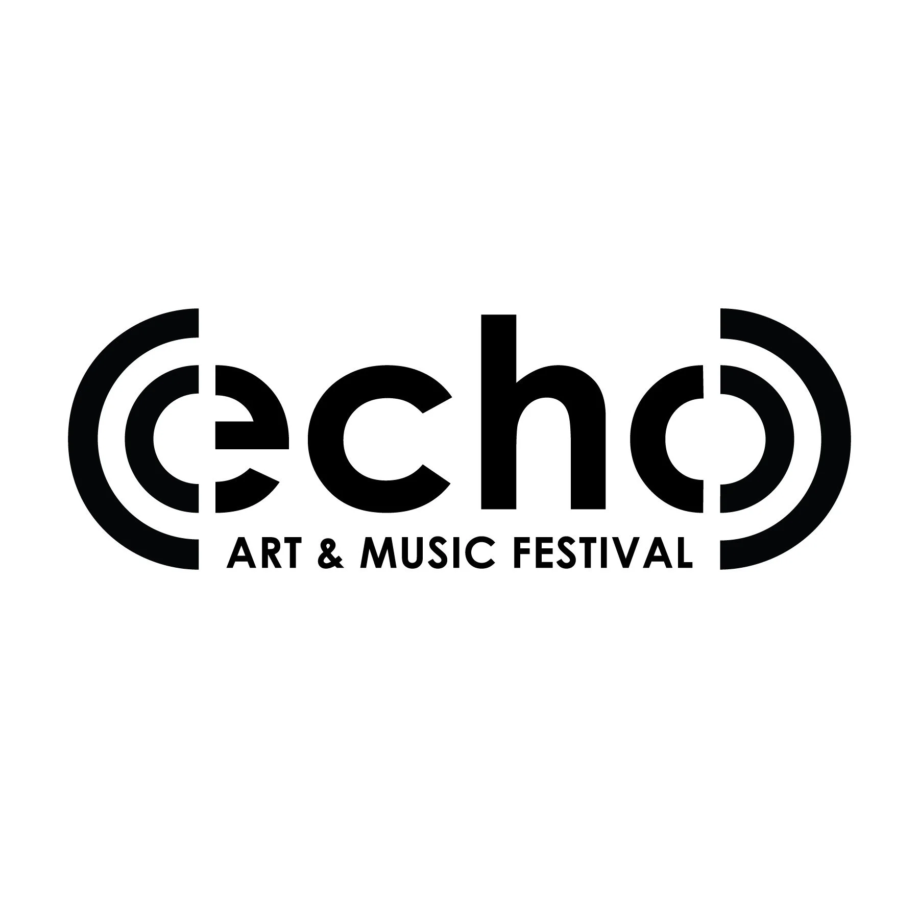
My design process began with researching logo trends in the festival community to create a logo that is eye-catching and on brand. I began designing multiple logos that emphasized both the music and mental health side of the company. I worked to create a logo that was modern, bold, and trendy to bring in guests. The digital sketches listed below are the logos I processed throughout the beginning of the design process. Creating a bold and appealing logo was the absolute first step to creating my brand.
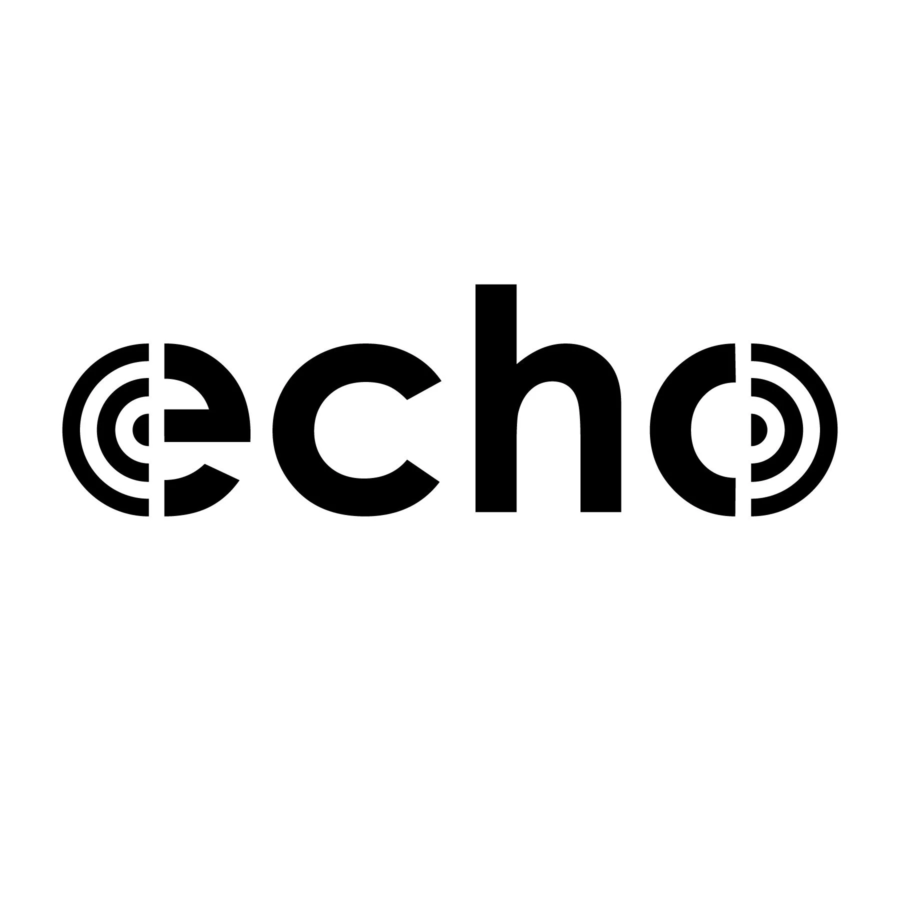
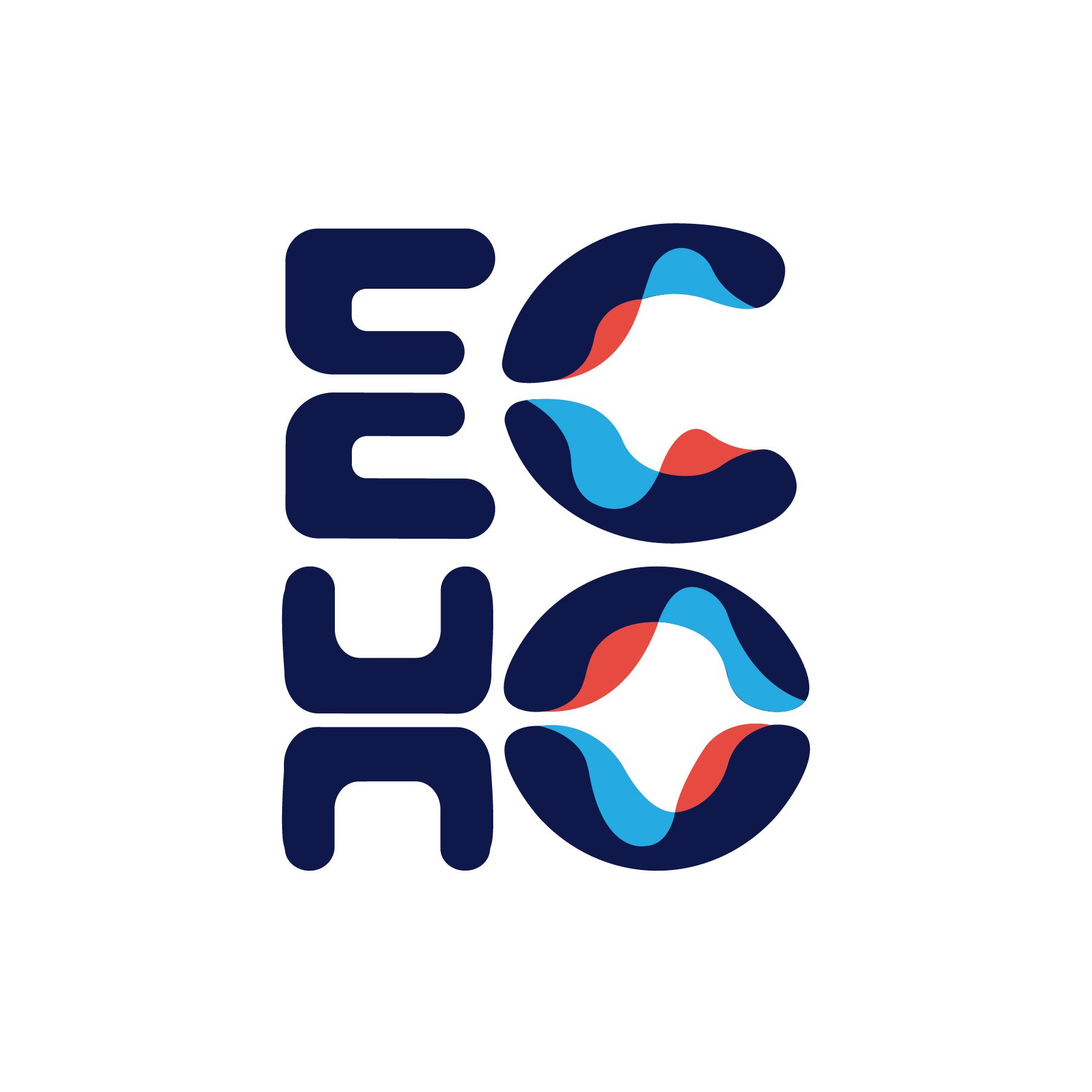
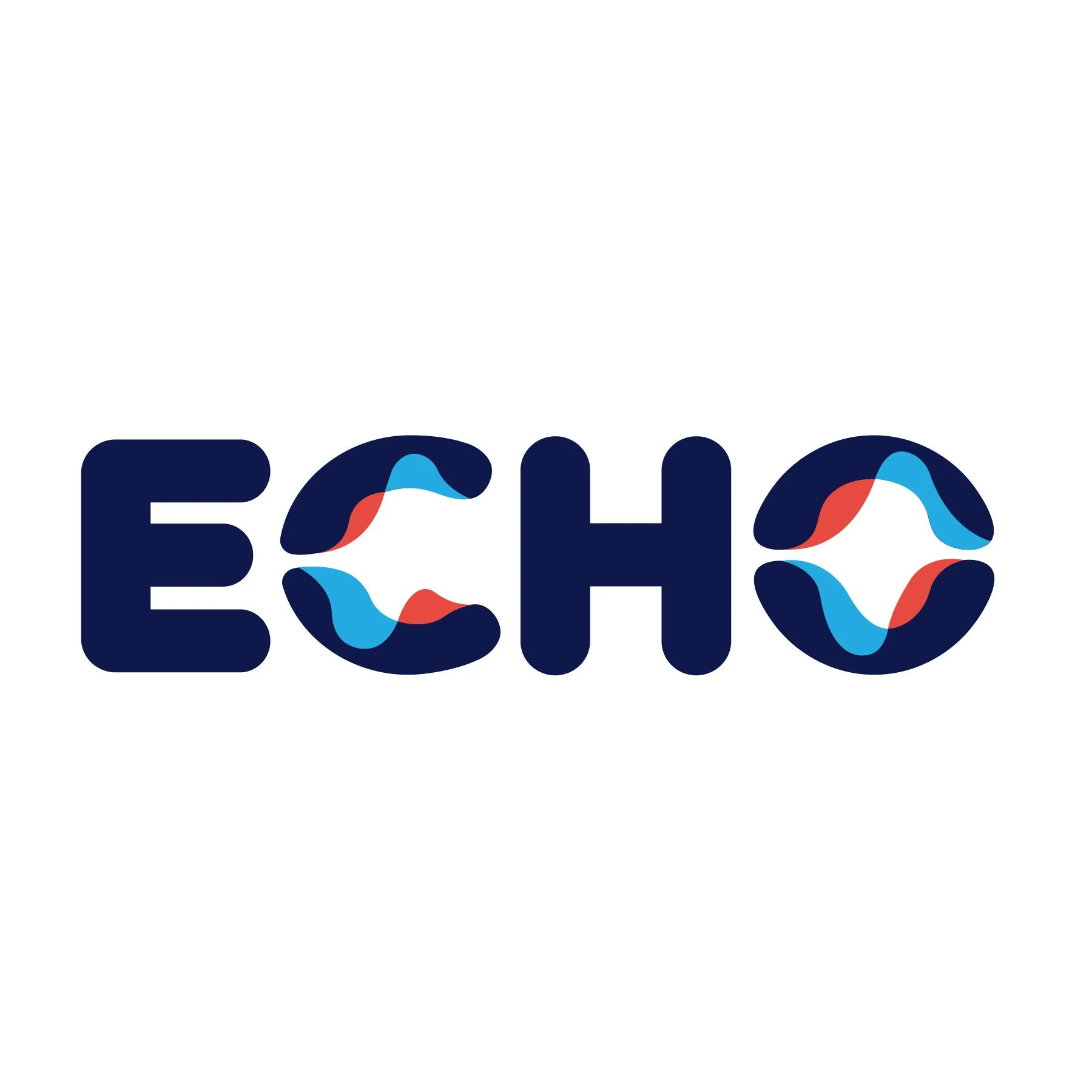
As my logo process developed, I landed on the concept of soundwaves echoing between letterforms. I attempted to show a progression of sound and communication through my logos that would support both the festival and mental health side of the event. I designed my logos to be curvilinear to give the brand approachability, unity, and communicate a sense of energy.
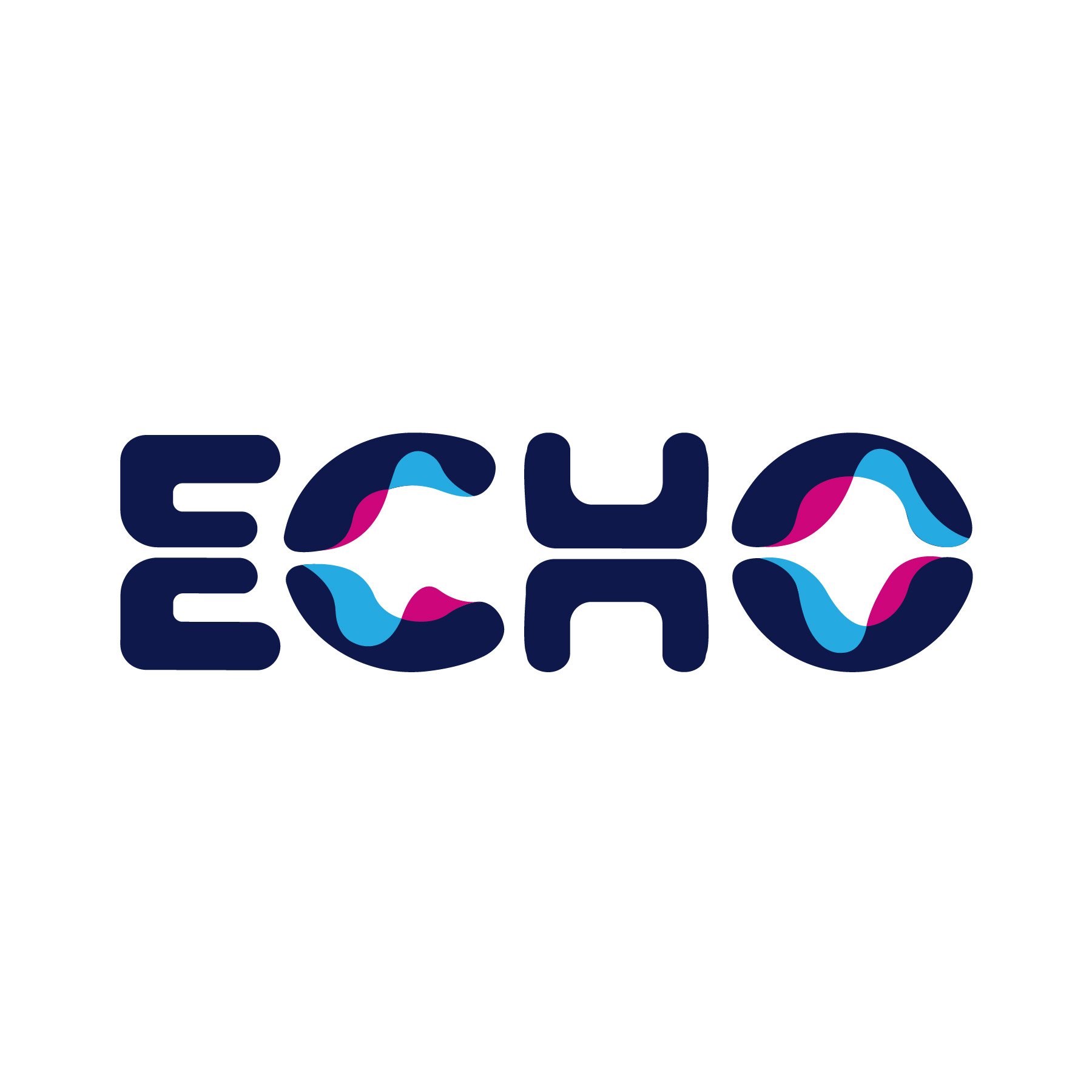
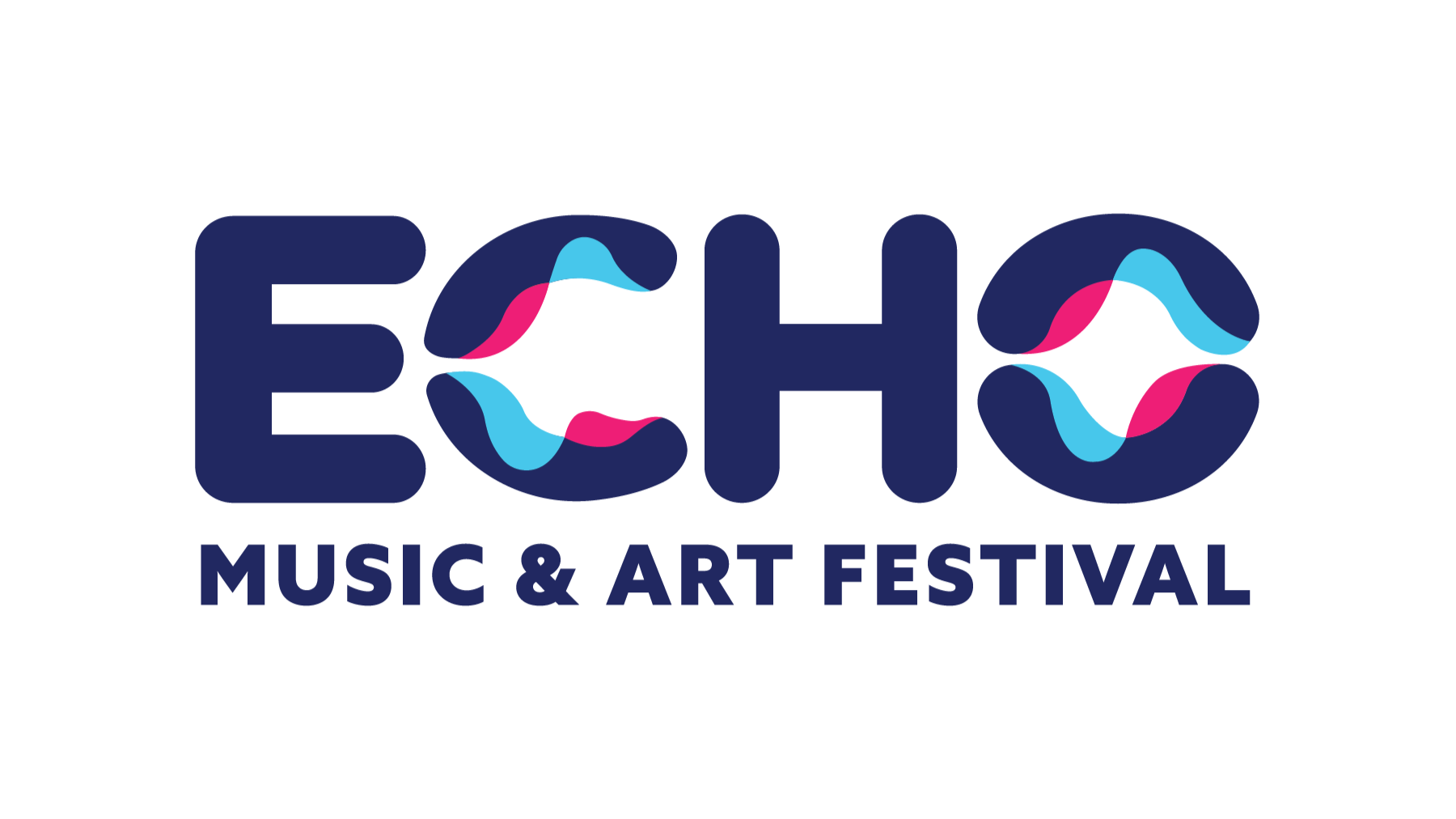
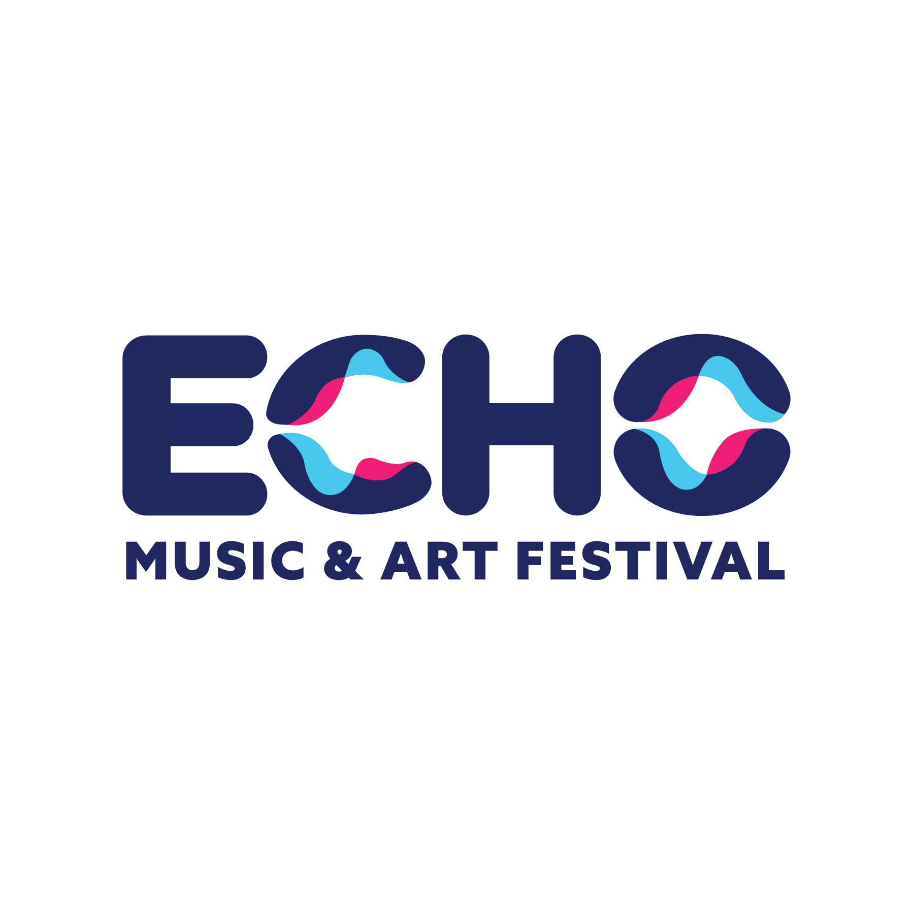
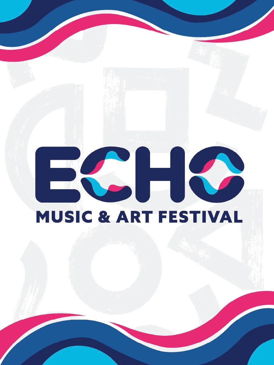
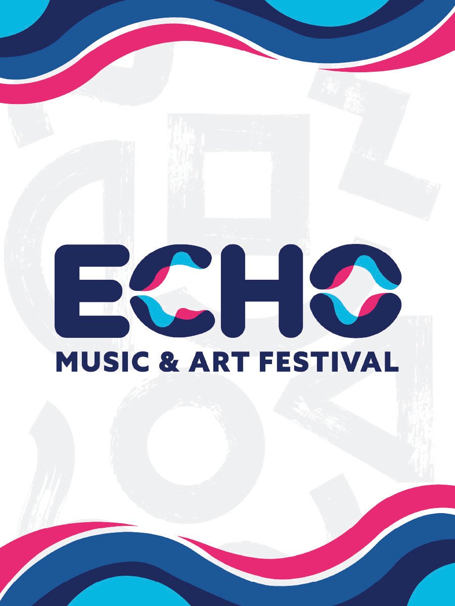
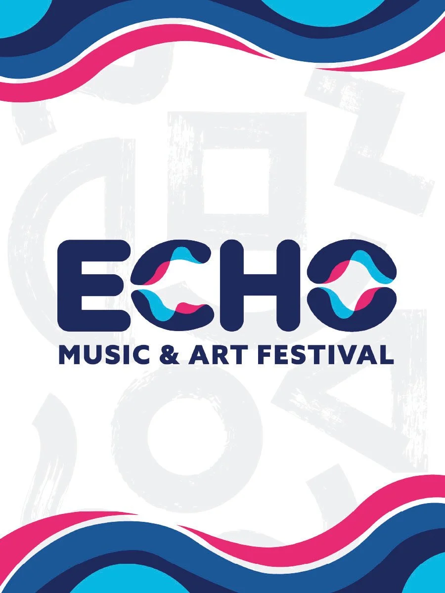
Primary Logo
The primary logo is created from curvilinear forms to communicate a sense of unity, connection, and positivity. Found within the name “Echo” are soundwave patterns flowing through the letterforms to communicate the music aspect of the brand. The letters E and O are divided in two with reflecting soundwave patterns to simulate the sound of one voice echoing out and being responded back to. The bold blue and pink hues lend a bold friendliness to the brand. A rectilinear sans-serif font is paired with the rounded logo to prevent the logo from becoming over-unified.
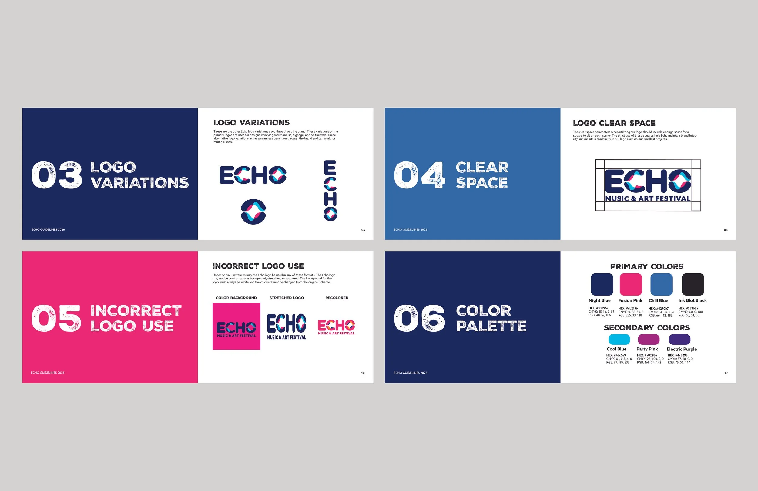
Brand Guidelines
The Brand Guidelines I created provide guidance when designing with the Echo: Music & Art Festival brand. This book ensures that there is brand consistency across all platforms. The brand guidelines booklet shows how to use logos, restrictions, colors, graphic elements, and typography.
Website
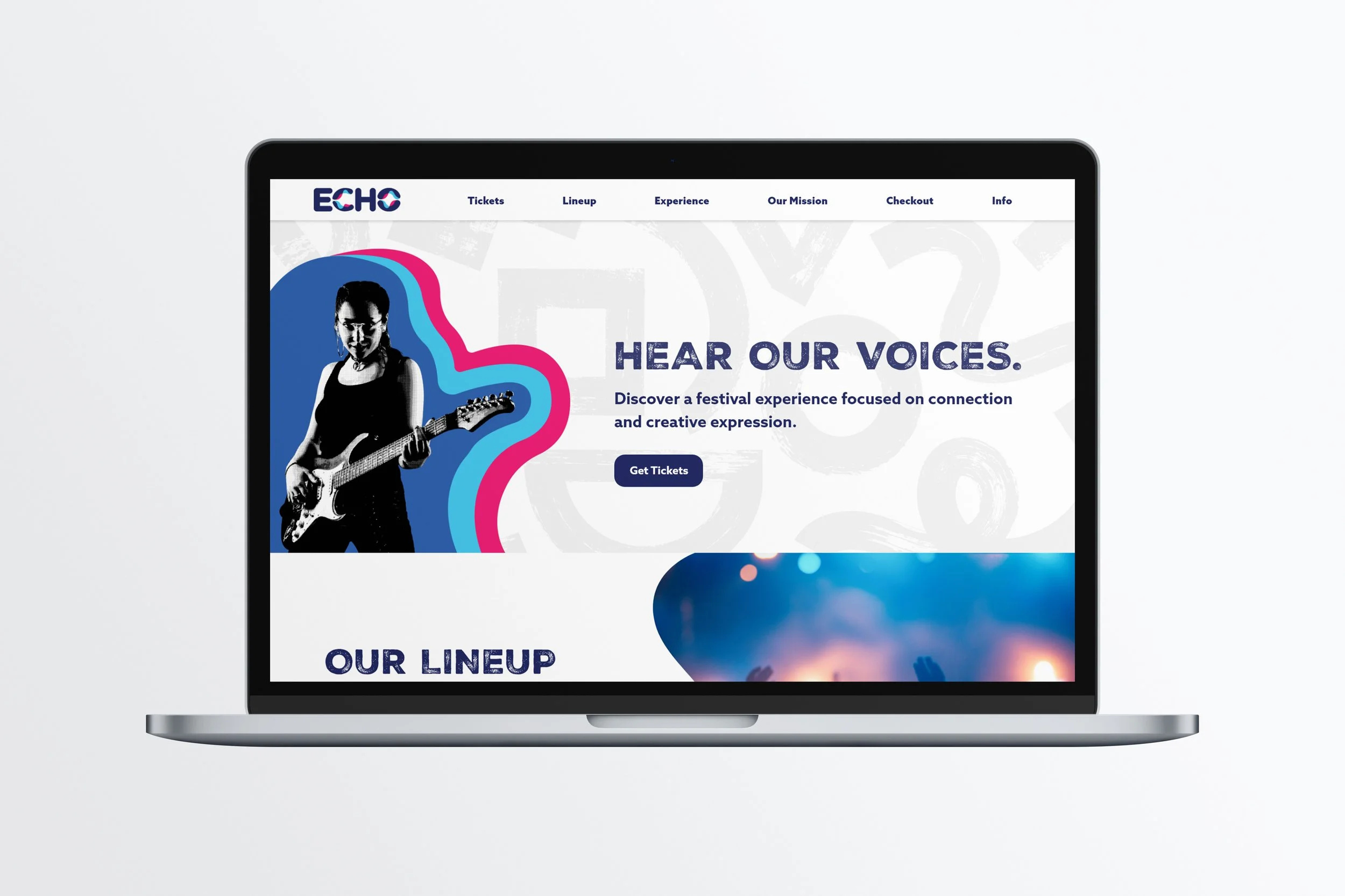
The Echo: Music & Art Festival website allows for seamless access to festival information and ticket ordering. All webpages contain a website hero that draws emphasis and intrigue to every page. The website includes festival information, map access, the band lineup, ticket purchases, and information on the company’s mission.
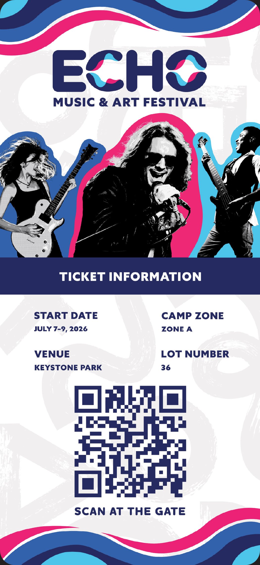
Ticket
The ticket is designed with the brand colors and wave graphics to tie the ticket into the brand. The ticket is designed in a mixed media fashion that incorporates bold colors, halftone patterns, and shapes.
Confirmation Email
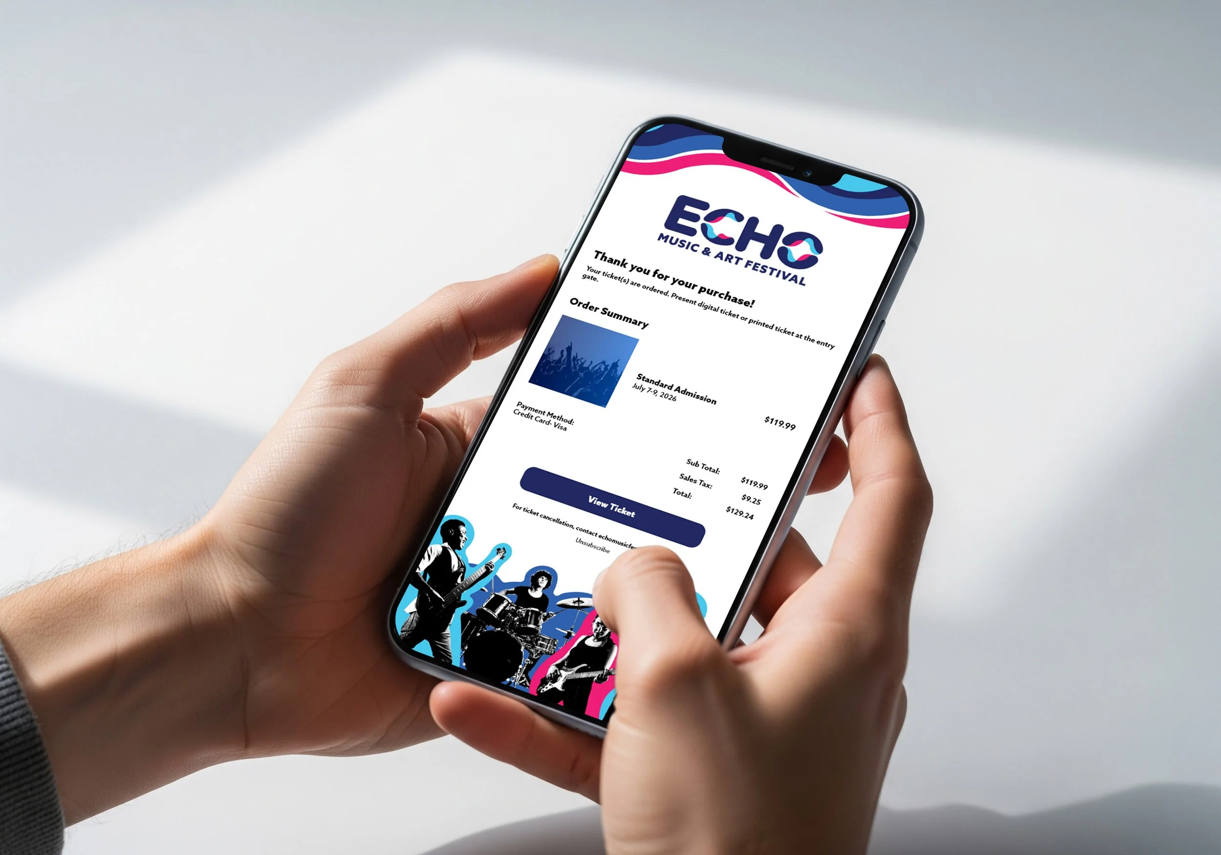
A confirmation email is a necessary design component, acting as a way for the customer to access the ticket they ordered. The confirmation email was designed with soundwave and halftone patterns used for other components of the brand.
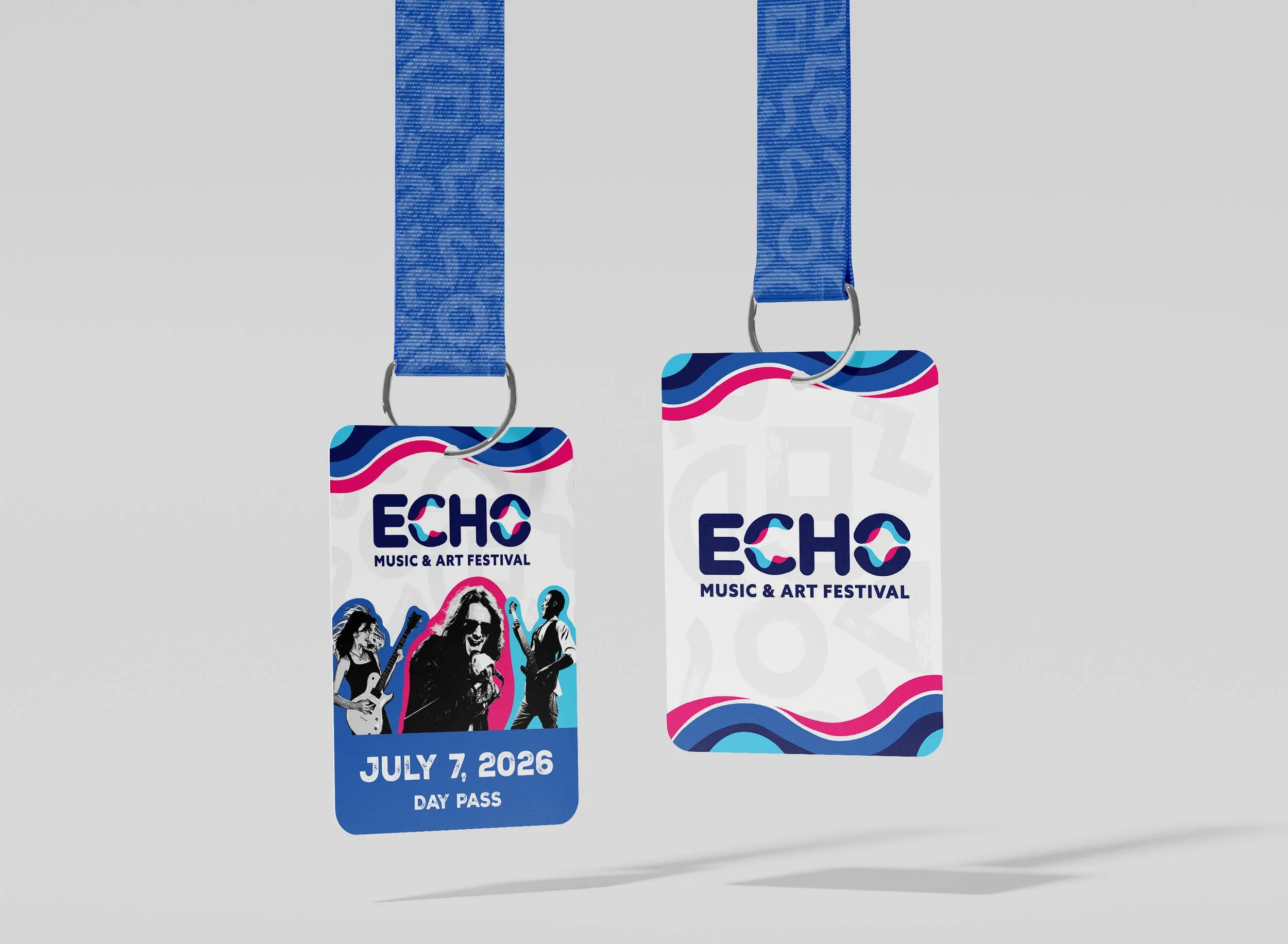
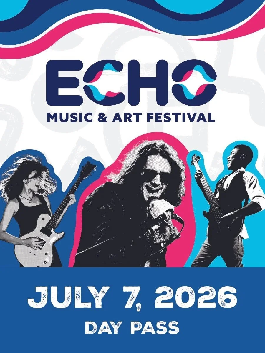
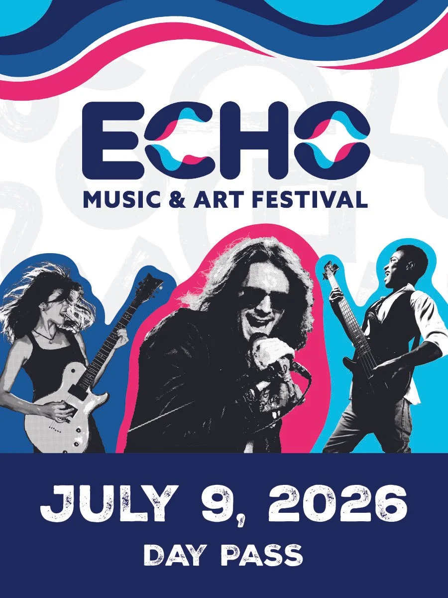
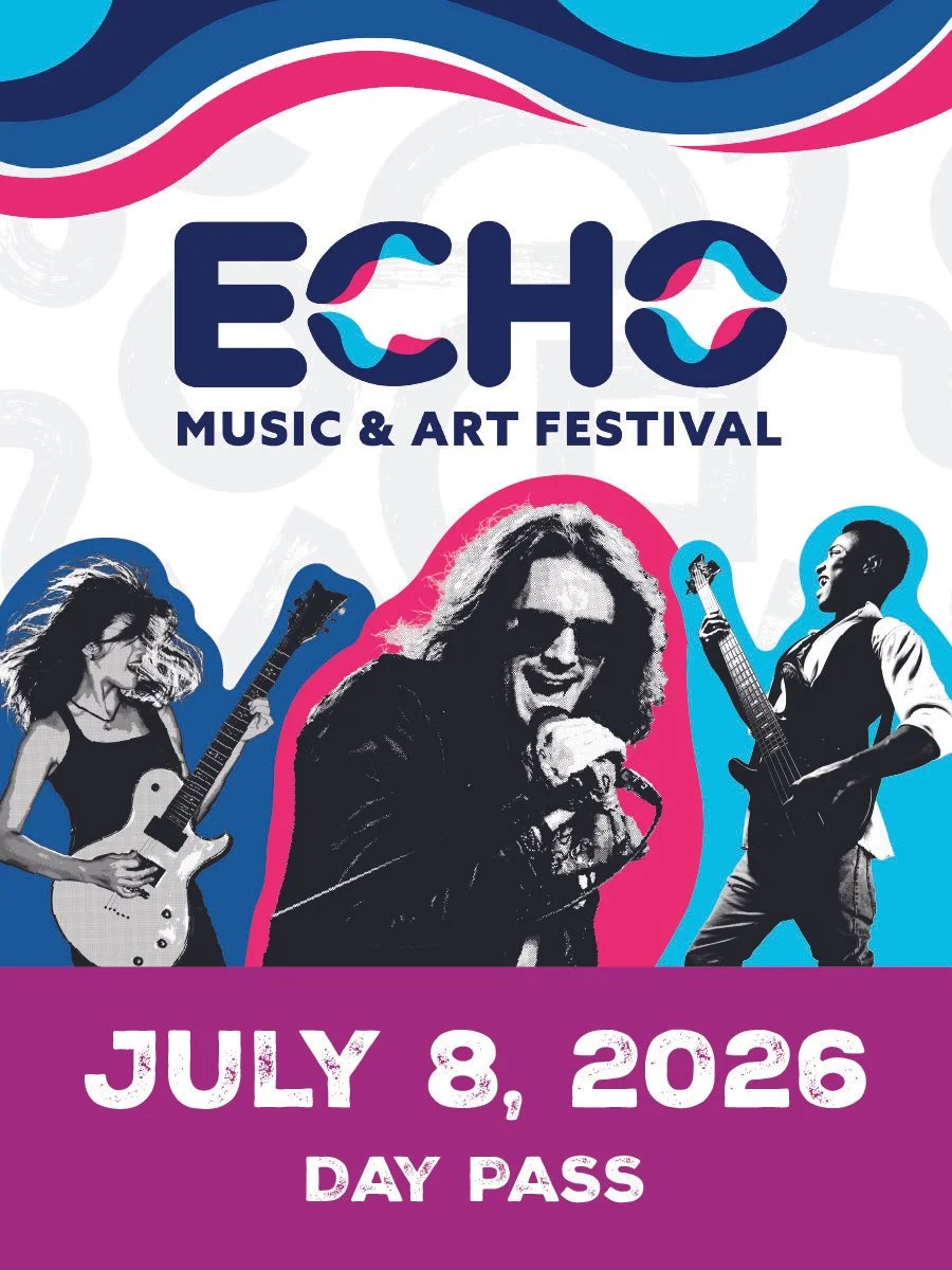
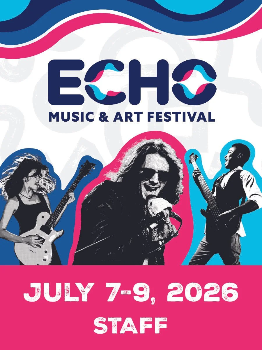
Lanyard Cards
The lanyard designs act as a form of identification for guests who purchased the day passes and staff members. The bold pink is used to differentiate between guests and staff members. The lanyard designs act as a special gift and memento for joining the experience. A textured sans-serif font was used to put emphasis on the dates the guests are attending.

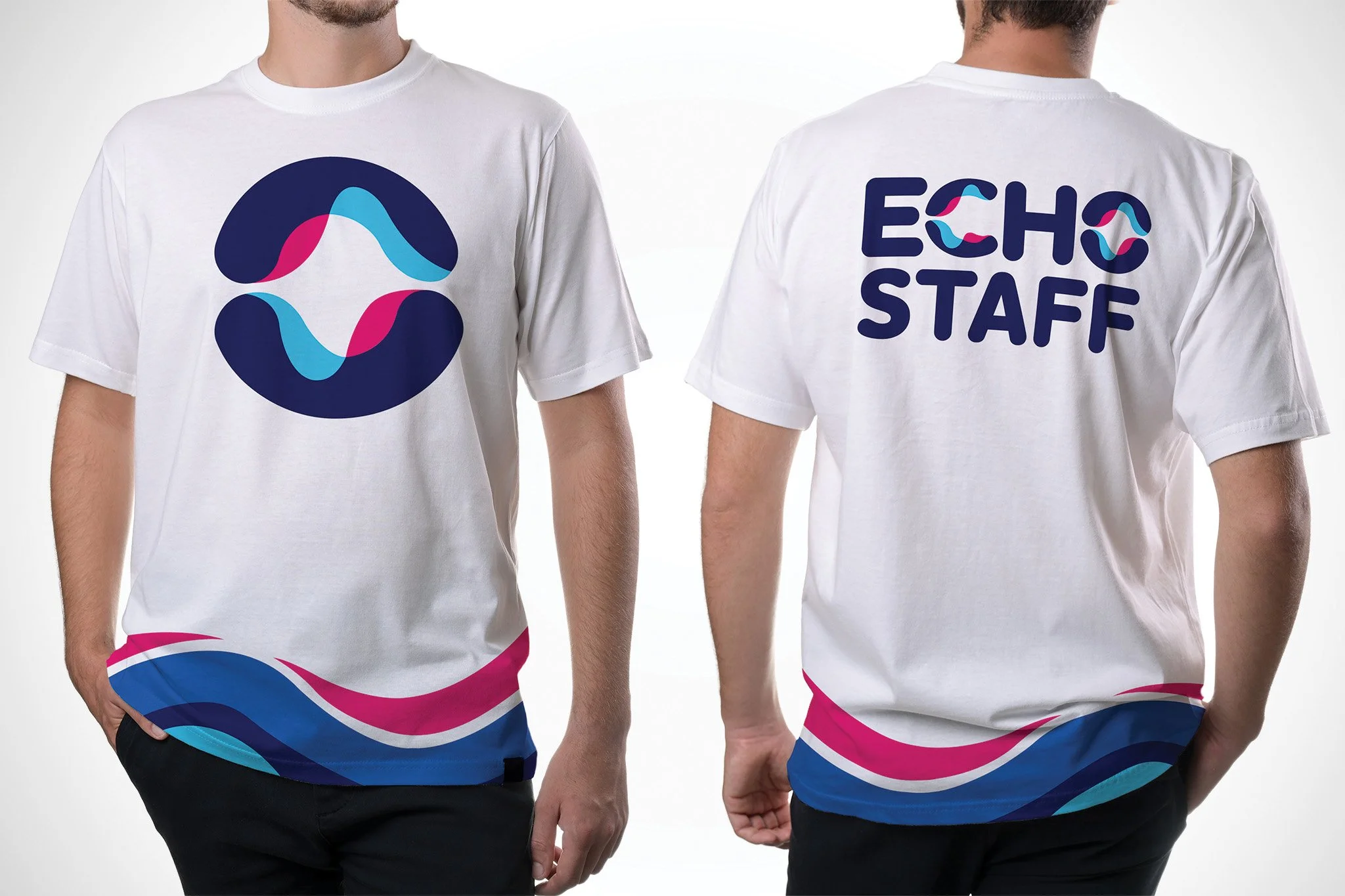
Staff T Shirt
The staff T shirt design utilizes the O from the Echo: Music Art Festival logo as a bold graphic element. The T shirt also sports the same soundwave pattern used throughout the brand. The staff shirt allows for festival guests to easily identify festival staff during the event.
Band Lineup Poster
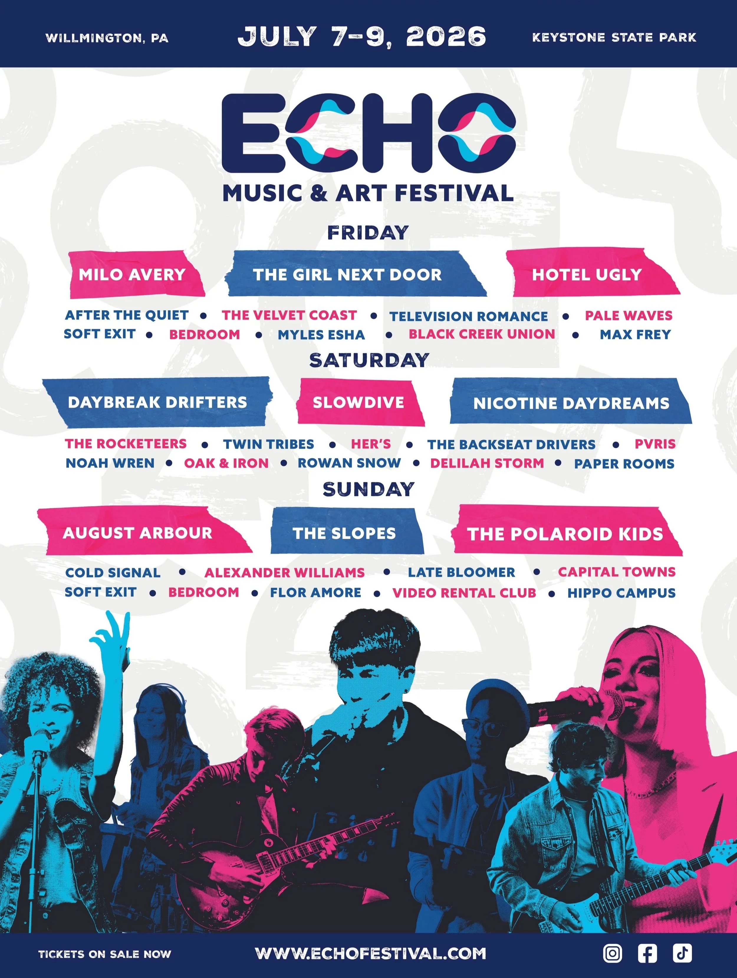
The band lineup poster was designed to communicate to festival guests what days different bands will be performing on. The poster is laid out by day with three headliners per day and the supporting acts are listed below them. The poster is designed with halftone patterns, a shape graphic, and the same bold color scheme.
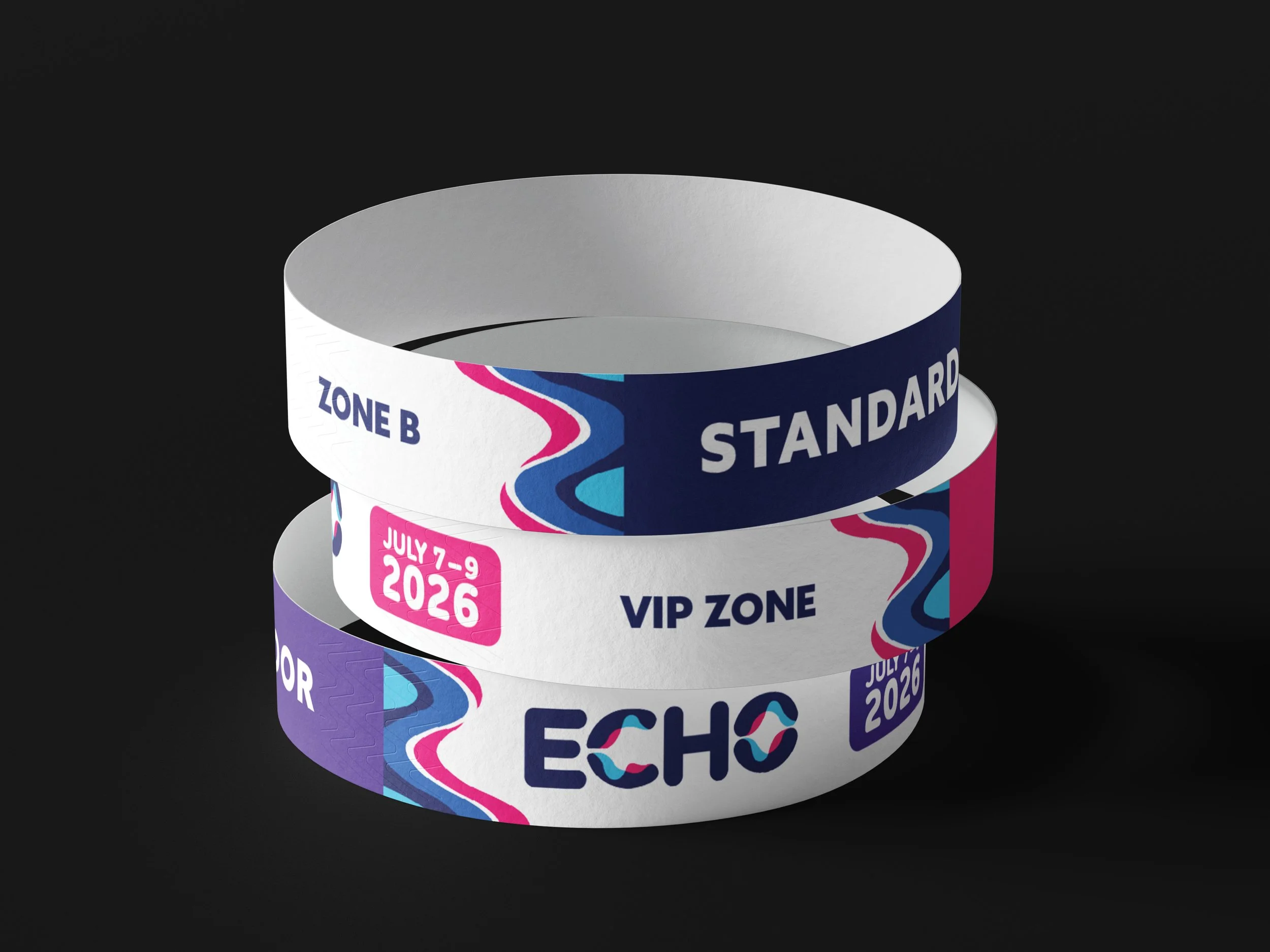
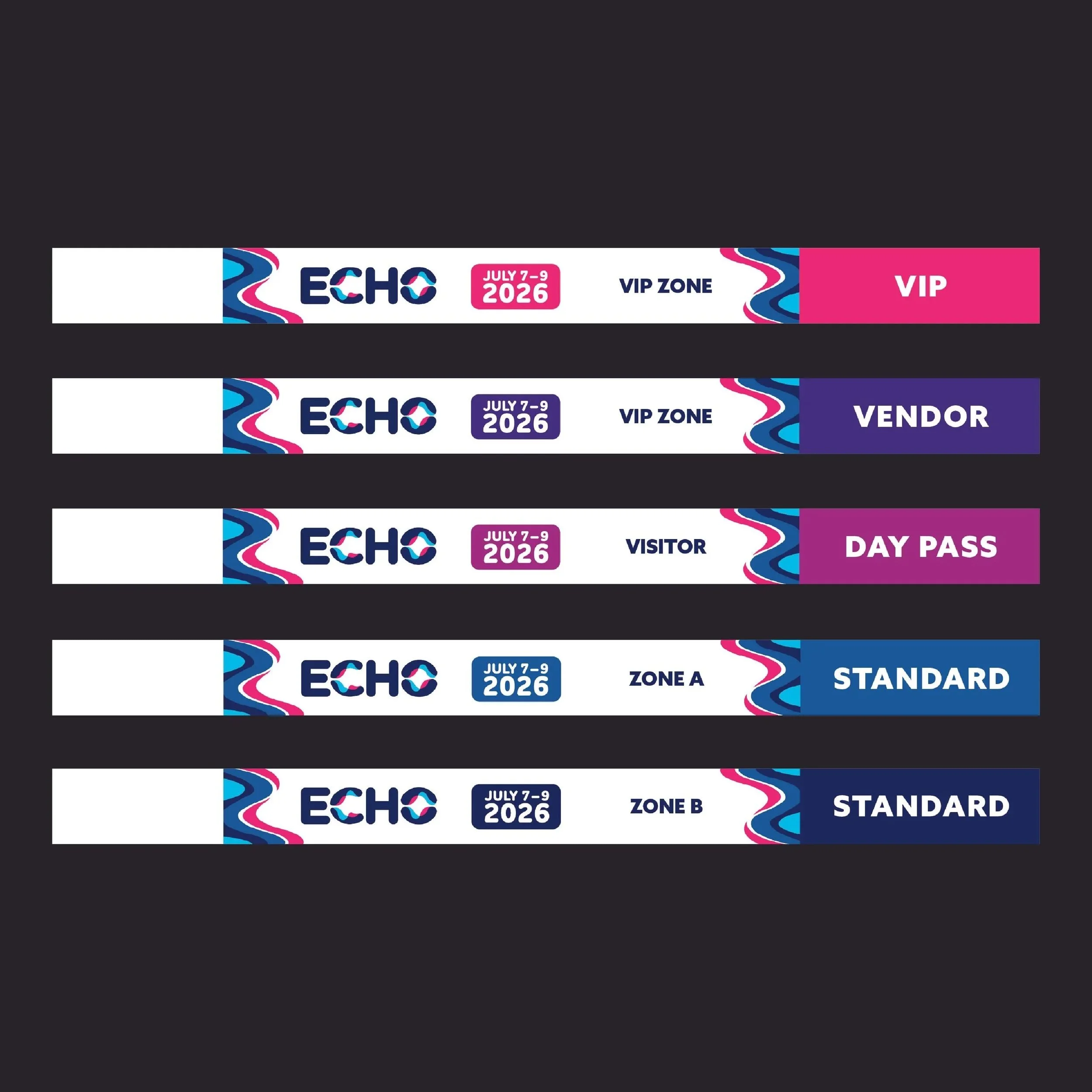
Wristbands
The wristbands act as a form of identification for all guests, staff, and performers at the festival. The wristbands are all within the brand color scheme and implement the same soundwave pattern. A bold pink is used to differentiate the band members from the rest of the guests in attendance.
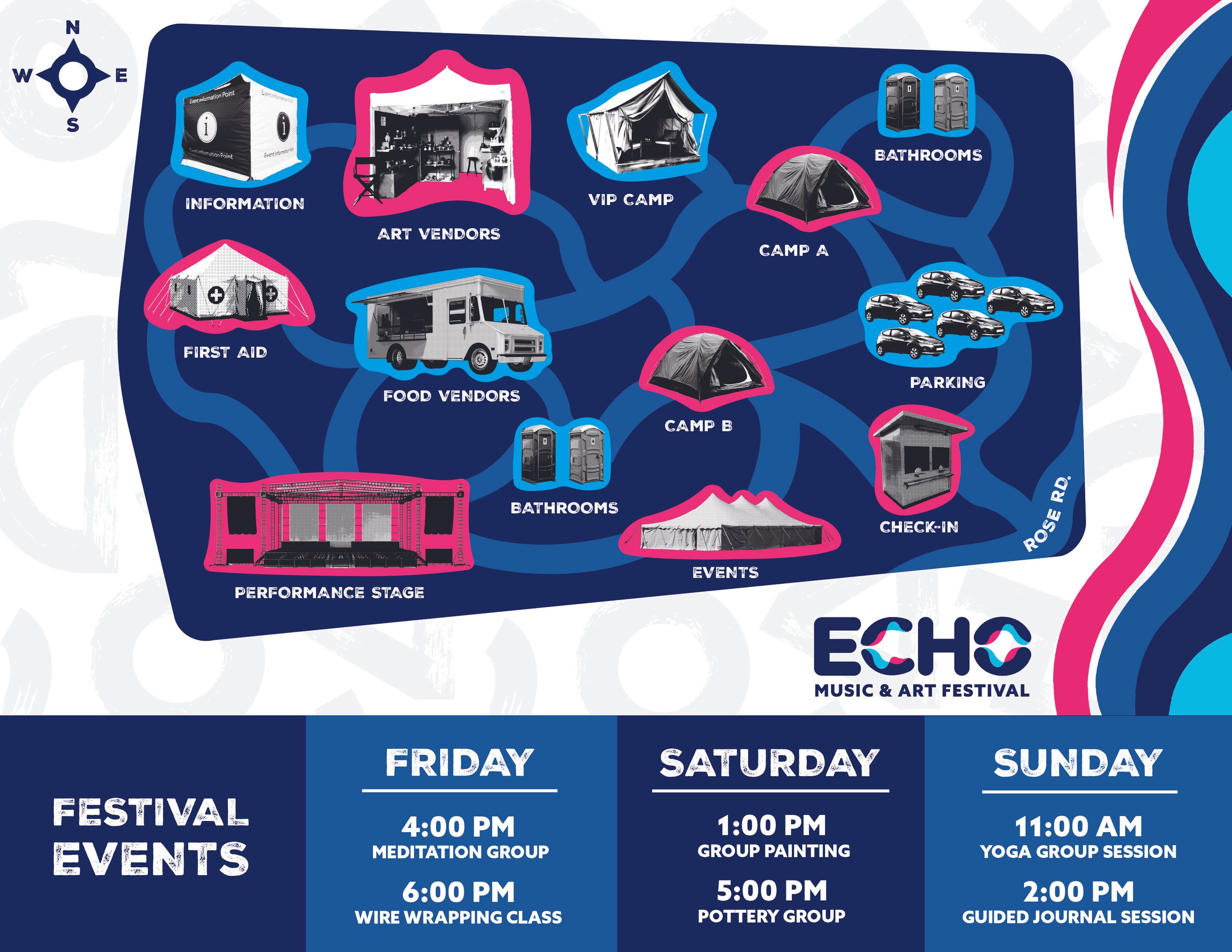
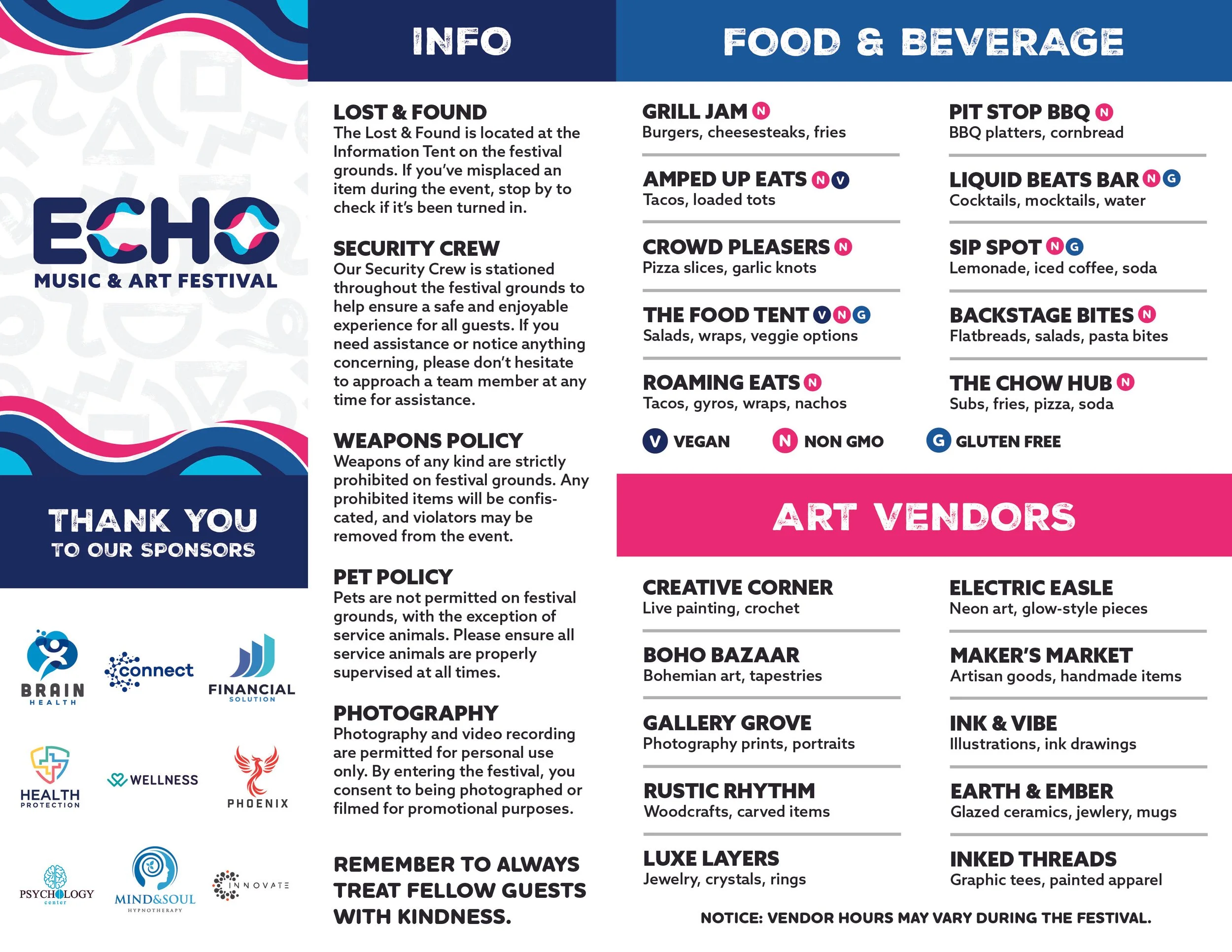
Pocket Guide Map
The pocket guide map acts as both an information pamphlet and map. The pocket guide map provides information on food and art vendors, general information, sponsor information, and event information. The map is designed in a mixed media/collage fashion and maintains the established brand.
Environmental Graphics
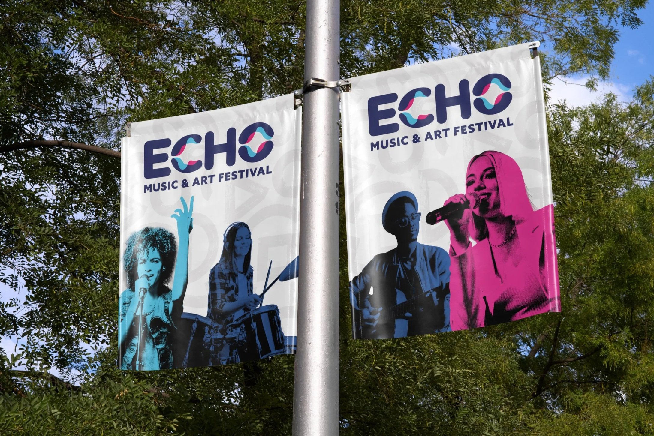
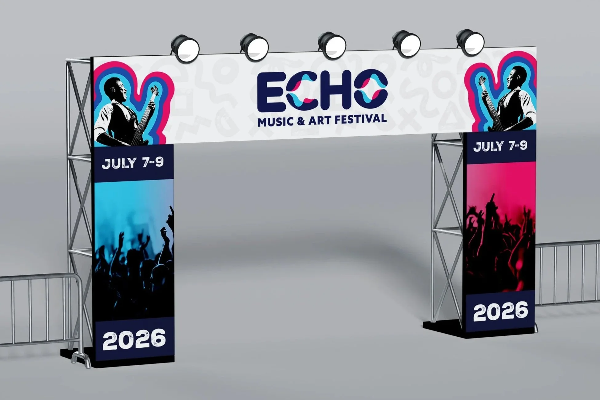
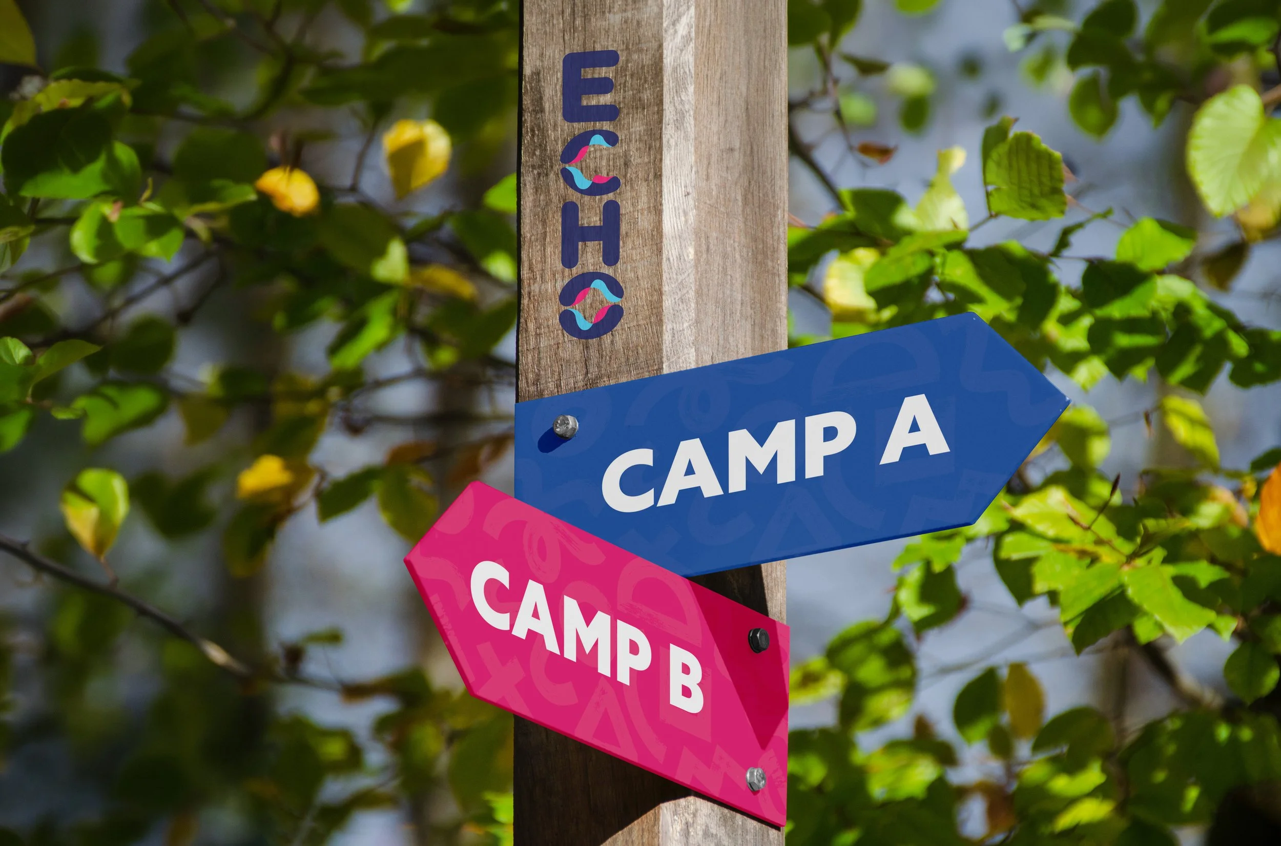
These environmental graphics communicate the brand’s identity at the festival grounds. The environmental graphics designed are a pole banner, stage banner, and camp wayfinding sign. The environmental graphics designed incorporate graphic elements from the brand like soundwave patterns, bold colors, shape patterns, and halftone patterns.